How To Make Mobile Horizontal Scrollable Menu In Elementor
In this blog, you will learn how to make a mobile horizontal scrollable menu in elementor pro. This can be used to create responsive websites or web pages.

How To Make Mobile Horizontal Scrollable Menu In Elementor
In this blog, you will learn how to make mobile horizontal scrollable menu in elementor pro. Here is used custom CSS feature of elementor pro and nav menu which is only available on elementor, it can't be replaceable with any plugins so, you must have elementor pro then you can apply it on your website. So if you don’t have elementor pro you can download it from here: https://dcreato.com/go/elementor So, we will learn the full process with a few steps so let’s begin:
- Place the widget
- Paste the CSS
- Bottom line
STEP-1 PLACE THE WIDGET
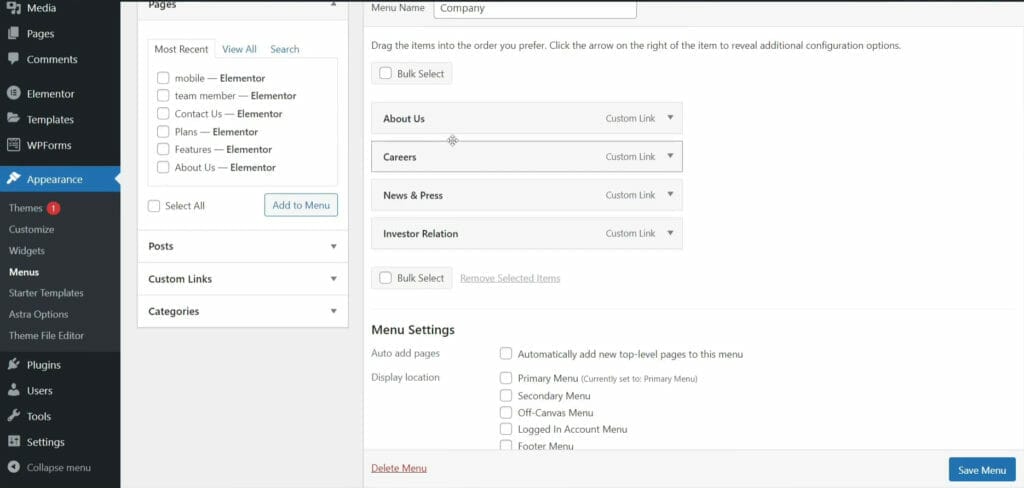
First, make sure that you have installed and activated the elementor pro. Then also you must have a menu in which you make a horizontal scrollable menu. So, here as you can see above in the images, I have created a menu, basically, I wanna make the primary menu a horizontal scrollable menu for mobile devices.
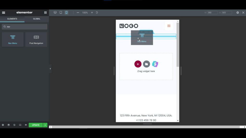
After activating the elementor pro, now go to the elementor editor page. Here we have to select one structure like here I'm selecting one column structure. Then search on the search bar nav menu, and you will see the widget, this is the elementor pro feature that's why you must have elementor pro.
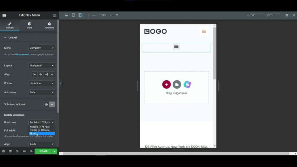
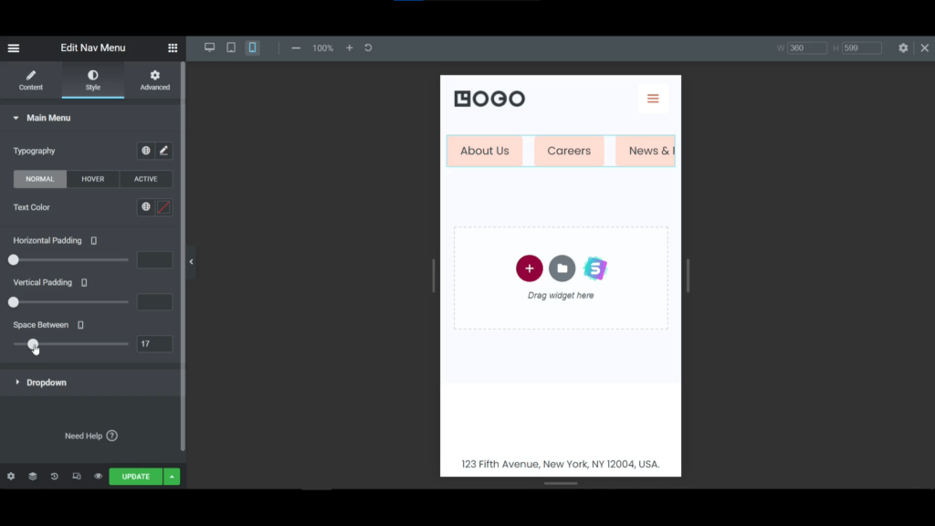
After placing the nav menu widget we have to customize it then we can put the CSS code for that the code will work properly. First what you have to do is select your menu from the menu option here I have selected the "company" menu and selected "none" on the pointer. After that, the important thing is that, you have to go to the mobile breakdown option in below and expand the dropdown menu. Here you will see three options, from there you have to select "none".
STEP-2 PASTE THE CSS
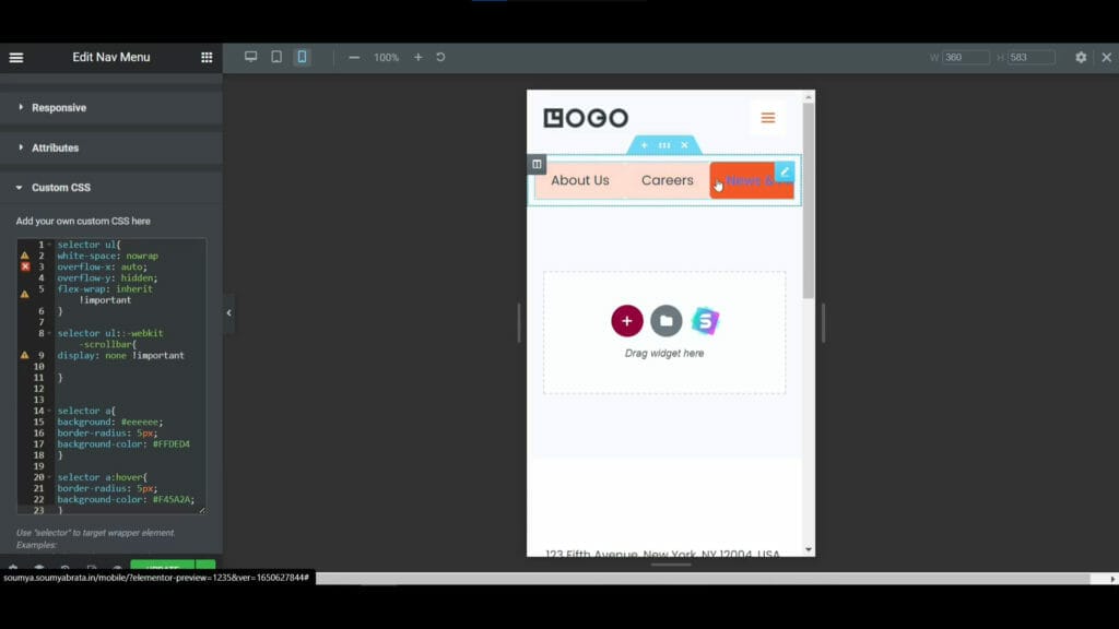
After customizing text size, typography, font-weight we have to put the custom CSS to make the horizontal scrollable menu. Here is the full CSS code below, you have to just copy it and paste it on your custom CSS:
selector ul{ white-space: nowrap overflow-x: auto; overflow-y: hidden; flex-wrap: inherit !important } selector ul::-webkit-scrollbar{ display: none !important } selector a{ background: #eeeeee; border-radius: 5px; background-color: #FFDED4 } selector a:hover{ border-radius: 5px; background-color: #F45A2A; }
After pasting the code our menu is like the above in the images. The menu texts are sticked with each other so, we have to give some space so to do that go to the style tab and expand the main menu option and increase the space between options then you will see that the menu texts are now equally placed with a distance.
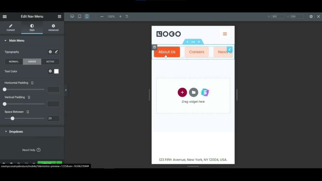
Now we have to customize it to make it more beautiful, here I have changed the text color to orange and made the background with light orange color and whenever someone hovers on it the text will be pure white and the background will be pure orange color. That looks so cool!
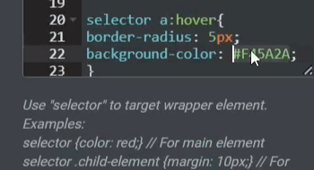
Now if you wanna change the light orange background color then you have to change the background color on the 22nd line of CSS code as you see above the image as usual go to the style tab and there you can change the text color and hover settings. So, that's the process of how you can create a horizontal scrollable mobile menu in elementor pro.
BOTTOM LINE
So, here in this blog, you have learned how you can create a horizontal scrollable menu for mobile in elementor pro. If you implement it on your website when visitors come to your website they will feel that they are using an app.
The most important thing is that WE MADE A VIDEO ON HOW TO MAKE MOBILE HORIZONTAL SCROLLABLE MENU IN ELEMENTOR, here’s the link, you can watch this you will better understand: https://youtu.be/22IETF9eYp8
That’s all there is to it! We hope that you’ve learned something new today and that you’ll be able to apply it to your own website. If you like it then share this post and if you have any questions or feedback on this blog, please leave them in the comments, or you can comment on youtube, we will reply to you shortly!
About Author

Hameed Aslam
Hameed Aslam is a website design and development expert, as well as an SEO and content strategist. He is the founder of DCreato and many other online ventures. Hameed's skills with web design, development, SEO, and content marketing have helped him achieve success in online business. He loves to help others learn about these topics so that they can also be successful online.
.jpg)


Latest Comments 0 Responses