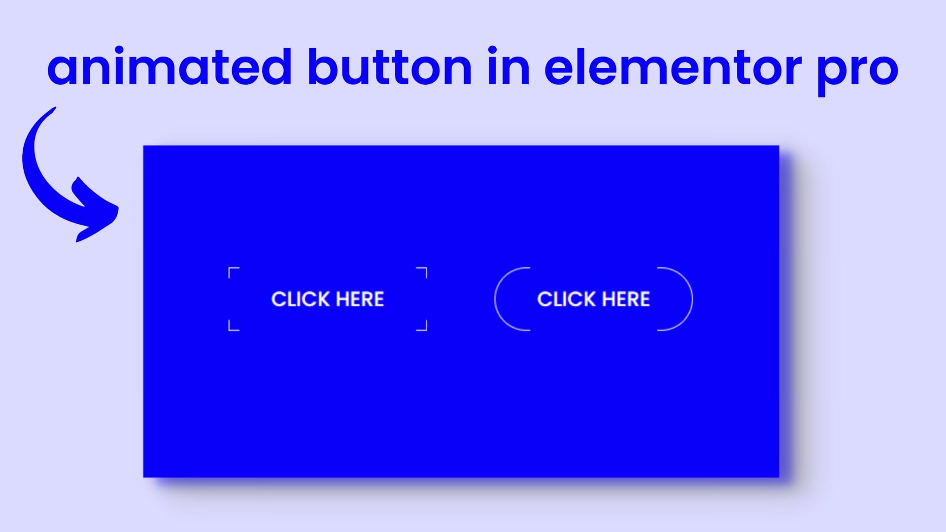
How To Make Creative Buttons With A Hover Effect In Elementor
If you are bored of using pre-made buttons and have not tried some creatively animated buttons so, now this blog will teach you how you can make creatively animated buttons using some CSS tricks,
How To Make Creative Buttons With A Hover Effect In Elementor
If you are bored of using pre-made buttons and have not tried some creatively animated buttons so, now this blog will teach you how you can make creatively animated buttons using some CSS tricks, but Don’t worry all the CSS snippets will be given below you have to just copy it and paste it on the right place. Basically, it works by using before and after effects, if you know about CSS you already know about the use of before and after effects. So, we will learn this whole process following a few steps so let’s begin:
- Place the button widget
- Customize the button
- Paste the CSS code
- Customize as your choice
- Bottom line
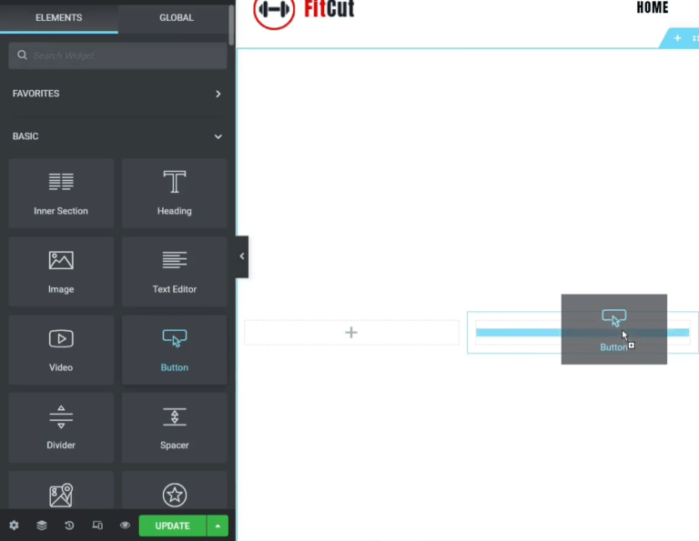
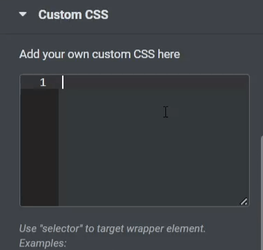
Step-1 Place the button widget
At first, you have to select a column structure, here I’m selecting 4 column structures to make different types of buttons, you can select one as well. After that, we will customize the button’s typography, alignment, and the most important thing is color, for now, make the background color TRANSPARENT and keep the text color BLACK. Why we are choosing background color transparent and text color black, we will know that very shortly.
Step-2 Customize the button
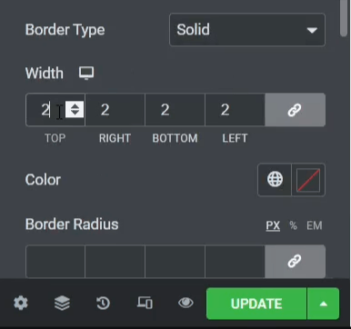
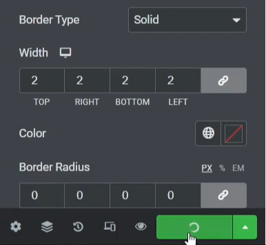
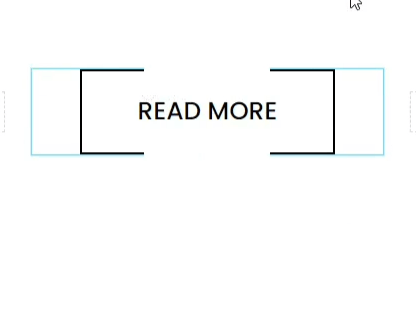
Now after changing the typography, size, fonts, and color we have to make a border so for that select solid from border type and give 2px of width and put the 0px value on border-radius and at last, don’t forget to click on the green UPDATE button to save your all works.

Now refresh the page and take a look at the button and you will see that there is nothing happening here when I’m hovering the cursor. Now time to put the CSS code on custom CSS on the advanced tab. So here is the CSS code given below just copy it and paste it into the custom CSS section:
Step-3 Paste the CSS code
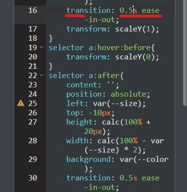
selector{ --size: 7px; --color: #ffffff; } selector a{ position: relative; } selector a:before{ content: ''; position: absolute; top: var(--size); left: -10px; width: calc(100% + 20px); height: calc(100% - var(--size) * 2); background: var(--color); transition: 0.5s ease-in-out; transform: scaleY(1); } selector a:hover:before{ transform: scaleY(0); } selector a:after{ content: ''; position: absolute; left: var(--size); top: -10px; height: calc(100% + 20px); width: calc(100% - var(--size) * 2); background: var(--color); transition: 0.5s ease-in-out; transform: scaleX(1); } selector a:hover:after{ transform: scaleX(0); } selector span{ position: relative; z-index: 3; } 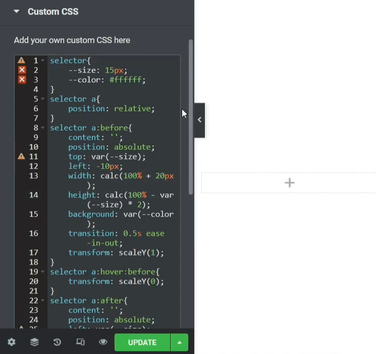
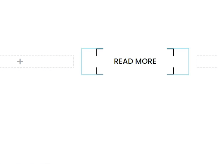
After putting the CSS you will see that the button’s style is now changed, now if I hover on the button the button’s border will be completed with a transition, that’s looking really awesome. You can see it here below:
Step-4 Customize as your choice
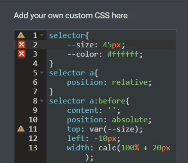
Now you can change the button’s font size, background color, animation speed everything. To change the border size follow the process. In the first row of the code you will find the size under the selector, here I’m giving 45px so you can see the left side and the right side border is completed now, but the top and bottom are incomplete, so by this process, you can change the border size as your wish.
If you want to change the transition speed, change this as well as I’m showing here. But make sure that you have to change the transition speed both means if you have to change the transition speed before and after both effects.
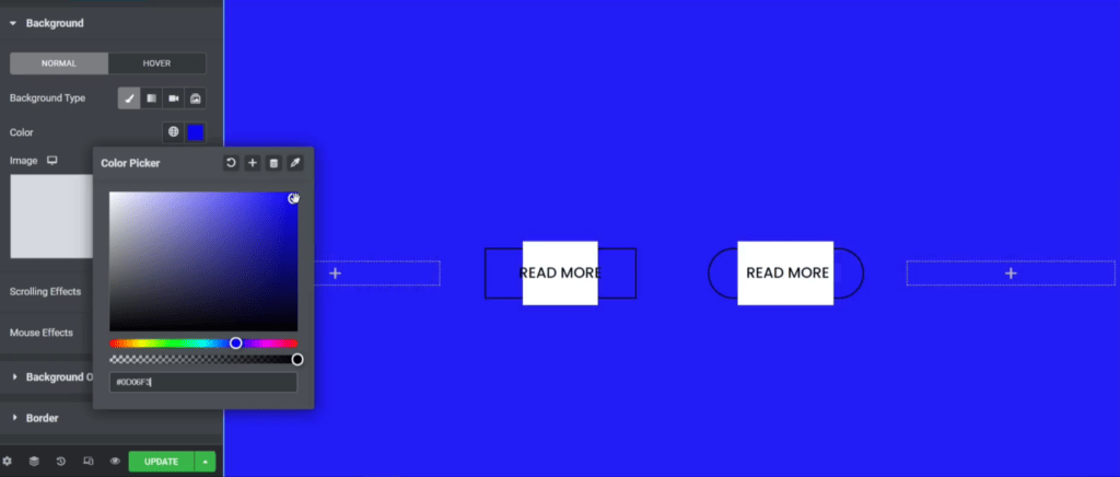

But this CSS will work only on the solid background color, it will not work on a gradient background color or any background images. So to change the solid background color you may know the process of changing the background color but after you change the background color you will see this type of interface shown in the first image, this is not working properly right! So, what you have to do that, at first is copy the background color code and go to the custom CSS and change the color in the first row that is SELECTOR, after you change it, you will see the results. Now it is working properly but the text color is black so if you change the text color so it will be looking awesome!
Bottom line
So, in this blog, we learned how to make creative buttons with a hover effect in elementor? Elementor is the most popular and powerful page builder that can create amazing creations with your creativity. The most important thing is that WE MAKE A VIDEO ON HOW TO MAKE CREATIVE BUTTONS WITH HOVER EFFECT, here’s the link, you can watch this you will better understand: https://youtu.be/0wbmzIsW6-8
That’s all there is to it! We hope that you’ve learned something new today and that you’ll be able to apply it to your own designs.
If you have any questions or feedback on this blog, please leave them in the comments, we will reply to you shortly!
About Author

Hameed Aslam
Hameed Aslam is a website design and development expert, as well as an SEO and content strategist. He is the founder of DCreato and many other online ventures. Hameed's skills with web design, development, SEO, and content marketing have helped him achieve success in online business. He loves to help others learn about these topics so that they can also be successful online.
.jpg)


Latest Comments 0 Responses