How To Create Curved Box Shadow Effect In Elementor
In this blog, you will learn how to create curved box shadow effect in the elementor.
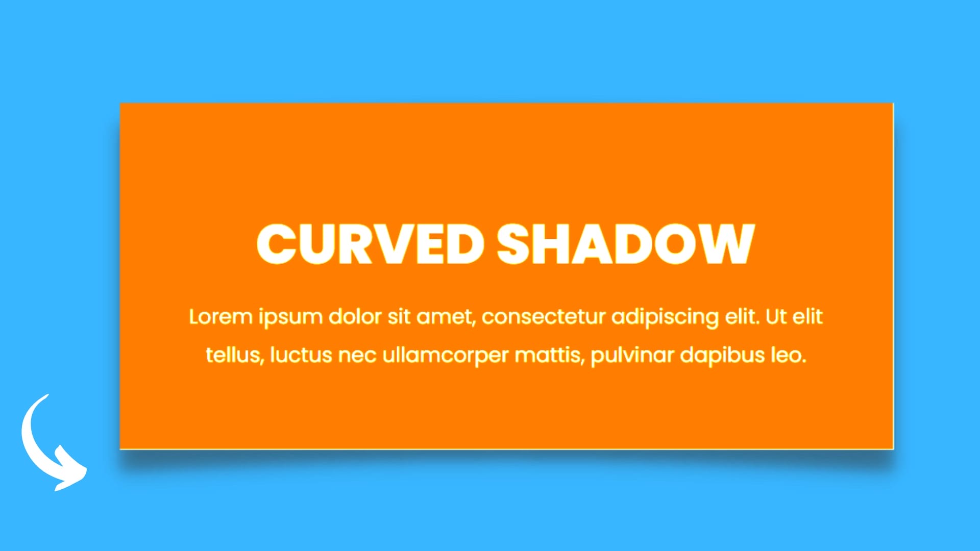
How To Create Curved Box Shadow Effect In Elementor
In this blog, you will learn how to create curved box shadow effect in the elementor. Here is the used elementor pro custom CSS feature, if you don’t have elementor pro then you can download it from here: https://dcreato.com/go/elementor So, we will learn the full process with a few steps so let’s begin:
- Place the section
- Paste the CSS
- Bottom line
STEP-1 PLACE THE SECTION
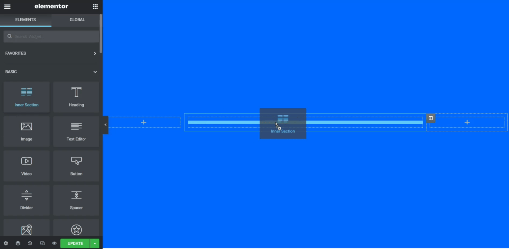
First, make sure that you installed and activated the elementor pro. Then we have to select one section, so here I have selected 3 column structure and made 20% of width to the left and right side columns. After that, we need to place one inner section into the middle column and delete one of them.
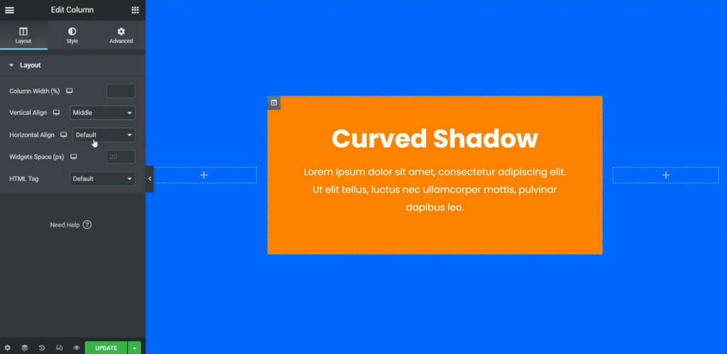
After deleting one column there will be only one column in the middle section. So, here I add this orange color to the inner section background and put some content to look good. Then click on the inner column and make the vertical align to the middle so that the content will place the middle vertically.
STEP-2 PASTE THE CSS
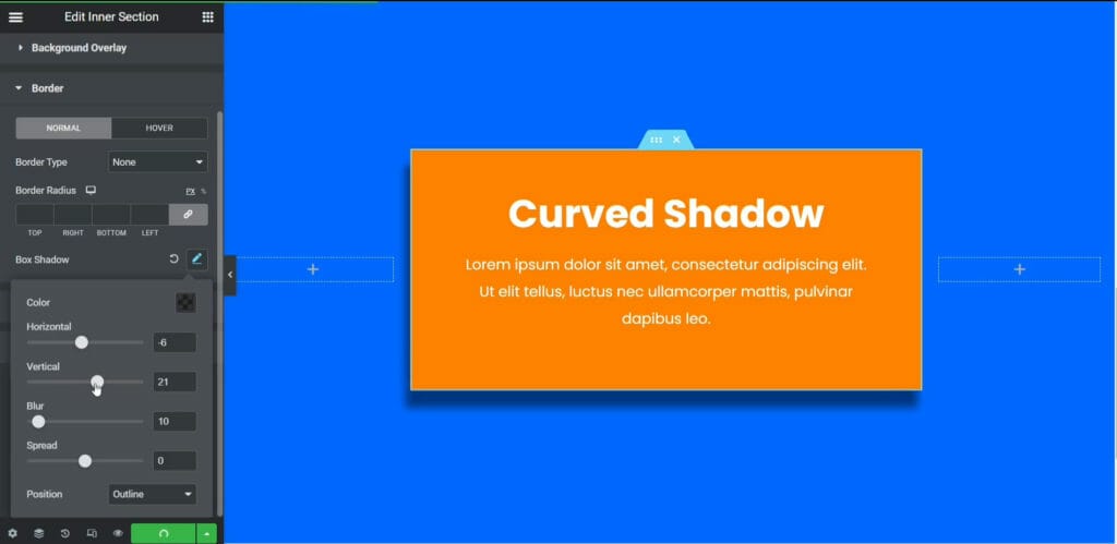
After making the orange background color and putting some content, click on the inner section and go to the Style tab and make the box shadow. So, here you can control the box shadow horizontally and vertically, also you can change the blur and spread. But there is no feature that you can create curve box shadow using elementor or elementor pro that's why we need to use some CSS to create the box shadow effect.
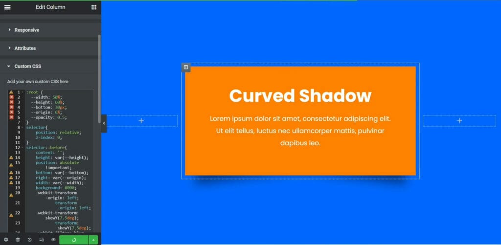
The most important thing is that you have to click on the outer column, not on the inner column. Then go to the advanced tab and scroll down and open custom CSS. Here is the CSS code is given below, you have to just copy it and paste it on your elementor custom CSS:
:root { --width: 50%; --height: 60%; --bottom: 30px; --origin: 6%; --opacity: 0.5; } selector{ position: relative; z-index: 9; } selector::before{ content: ''; height: var(--height); position: absolute !important; bottom: var(--bottom); right: var(--origin); width: var(--width); background: #000; -webkit-transform-origin: left; transform-origin: left; -webkit-transform: skewY(7.5deg); transform: skewY(7.5deg); -webkit-filter: blur(15px); filter: blur(15px); opacity: var(--opacity); z-index: -9 !important; } selector::after{ content: ''; height: var(--height); position: absolute !important; bottom: var(--bottom); left: var(--origin); width: var(--width); background: #000; -webkit-transform-origin: right; transform-origin: right; -webkit-transform: skewY(-7.5deg); transform: skewY(-7.5deg); -webkit-filter: blur(15px); filter: blur(15px); opacity: var(--opacity); z-index: -9 !important; }
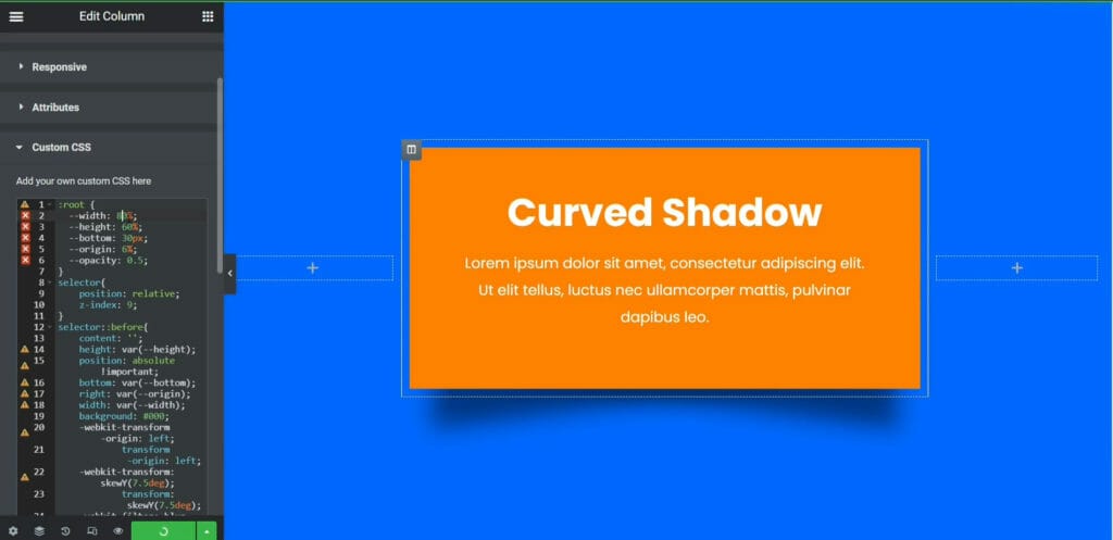
Just after pasting the CSS code, the curve box shadow will automatically come and you can control also the shadow width and opacity of everything. Here above in the images as you can see, if I increase the width to 80% then the shadow will become wider, also you can increase or decrease the opacity. So you can play around with all these features and set it as your wish. So, here is the process of how you can create a curved box shadow effect using custom CSS.
BOTTOM LINE
So, here in this blog, you have learned how you can create curved box shadow effect using elementor pro. You can use this on the pricing section, service cards, feature section, or anywhere it is suitable, that will look so awesome.
The most important thing is that WE MADE A VIDEO ON HOW TO CREATE CURVED BOX SHADOW EFFECT IN ELEMENTOR, here’s the link, you can watch this you will better understand: https://youtu.be/y-Cf_GtyyCo
That’s all there is to it! We hope that you’ve learned something new today and that you’ll be able to apply it to your own website. If you like it then share this post and if you have any questions or feedback on this blog, please leave them in the comments, or you can comment on youtube, we will reply to you shortly!

.jpg)


Latest Comments 0 Responses