10 Steps to Make Your Brand Stand Out in the Crowd
Your brand is more than just a logo and company slogan. It's your image, the first impression people get of you, and it can make or break how successful you are.

10 Steps to Make Your Brand Stand Out in the Crowd
Your brand is more than just a logo and company slogan. It's your image, the first impression people get of you, and it can make or break how successful you are. If you're looking for ways to improve your business, this blog post will give you ten tips on making your brand stand out in the crowd.

Make your logo stand out.
Your logo is the first thing that people see when they come into contact with your brand. There are many things you can do to make your logo stand out too. You can experiment with different fonts, colors, and shapes to find what looks best on print materials or social media sites.
Experiment with different fonts
Different fonts evoke different feelings in people. For example, if you're marketing something that is meant to be happy, then choosing a bubbly and round font will help achieve that goal. Choosing between sans-serif and serif fonts can also make your words aesthetically pleasing.
Experiment with Colors
Choose colors that match your brand. If you want to give off the impression of strength, use bold colors like red or black. You can experiment with different shades of one color to see what works best for your brand before settling on one specific color. Experimenting with different colors may also be necessary because even though many companies share the same niche as yours, chances are they'll all have various color schemes.
Experiment with Shapes and Graphics
Different shapes evoke certain feelings too! For example, triangles represent strength or power, while circles are used to show that something is complete (like finishing a life cycle). There's also the arrow which can be seen as pointing towards progress or plans, so it's essential to consider what shape your logo should be before you finalize it.
Create an eye-catching company slogan
A good company slogan is one of the first ways people will contact your brand. Of course, you want this to be something memorable and unique, like "Just Do It" or "Think Different." The trick here is to make sure you have a catchy phrase that fits what your business does without being too long or complicated.
Define your slogan
Defining your slogan is the first step. Keep this phrase short, simple, and memorable. This should be a catchy phrase that fits what your business does without being too long or complicated.
Your goal with a slogan is to have it fit on a cup or advertisement space, so you need to keep it concise.
Remember that being creative is essential but will only get you so far. It would help if you had a good reason for using a specific combination of words and color schemes to stand out from the crowd.
Create a one-sentence summary of what you do
The one-sentence summary is the second thing people will see when they come into contact with your brand. This sentence needs to be informative, concise, and memorable because this is what you'll use in all of your marketing materials like website bios or social media posts. It's also essential that it makes sense by itself so you can't use anything like "innovative" or "first-ever."
Do some research on your competitors.
It's important to know what else is out there. It can be easy to get caught up in creating something that you lose sight of the fact that other companies are doing similar things, and it may affect how people perceive your brand.
For example, let's say that you're starting a new business that offers personal fitness classes to people who are just getting started on their journey of self-improvement. Now, there may already be companies out there like this, but it's essential to think about what makes your brand different from them and how you can use those differences to your advantage.
Find out the words that people associate with your company.
Using words that people associate with your company can help to make it more memorable. For example, if you're selling children's clothes, then using the word "fun" in an ad for your brand would give off a positive association while also attracting attention from parents looking for fun outfits for their kids.
Use those keywords to create a catchy phrase.
Creating a phrase using words that people associate with your company can help to make it more memorable. Using the example above, something like "fun fashion for kids" would be an easy-to-remember phrase that gives off positive associations. The word "fashion" is used because anyone who has bought clothes for their children knows how challenging this can be.
The easiest way to make something memorable is by using words that are easy for people to recall or have positive associations. You want your brand slogan, one-sentence summary, and keywords all to work together, so you don't get too repetitive while still being catchy enough for everyone who comes into contact with it to remember.
Brainstorm different slogans and choose the best one
A good slogan is catchy, memorable, and unique. One way to find an excellent motto for your brand is to brainstorm different options with friends or family members who have an outside perspective. You can also do some research online by looking at other companies' slogans and the keywords they use in their ads, so you know what people usually associate with your industry.
Once you've chosen the best one, make sure to stay consistent throughout all of your marketing materials, including ads and bios on social media platforms like Facebook or Instagram. If someone sees a different slogan used in an email than what they saw on your website, then it might cause them to question whether or not that's your brand or if you're trying to trick them.
Please test it out on friends, family, or coworkers for feedback
Getting your friends, family members, or coworkers to test out slogans can be a great way to get feedback and ensure that it's something people will remember. You should try saying the saying in front of them and seeing how they react and if any parts of it don't make sense together.
Hire a graphic designer
There are so many different things that you can do to improve your business, but sometimes it isn't easy to know where to start. If you're having trouble finding the perfect ideas for enhancing your brand image, consider hiring someone who knows what they are doing! A professional graphic designer will have no problem taking all of your thoughts and turning them into a cohesive design that will make your business stand out.
![]()
Consider using unique fonts.
There are so many different font options available these days, but not all of them fit the tone or image you're trying to portray with your brand. Use popular ones like Times New Roman for formal occasions and go crazy with playful cursive fonts for a more casual look.
What is a font, and why should I care about fonts
Fonts are specific types of lettering that you see in writing. They come in different styles and either serif or sans-serif fonts (this means whether they have small lines at the end of each stroke). Sometimes there will be subcategories within these two major ones like italic, bold, or underlined text. Fonts can be used to portray different moods or styles, so they need to fit the tone of your brand.
Types of Fonts
The most popular types of fonts used today include:
- Sans-serif fonts are the type that doesn't have those trim lines at the end of each stroke and tend to look more clean and modern.
- Serif fonts are the type that has those trim lines at the end of each stroke and tend to look more casual or traditional in style.
- Script/Cursive fonts - these usually mimic writing with a fancy pen and tend to look more elegant and classy.
- Slab Serif - these are a modernized version of serif fonts that looks bolder than the traditional style.
- Decorative fonts - these are used when you want your brand image or words themselves to stand out rather than just describing what they are in an ordinary font.
If you're looking for inspiration on which type of font to use for your brand, consider browsing through Font Squirrel's list of free fonts that you can download and try out.
How to choose the right font for your brand
Choosing the right font can be difficult, but there are a few things to keep in mind when determining which will work best for your company.
- Familiarity - if you're targeting people who have seen similar fonts before, it would make sense for them to recognize yours more efficiently, making them feel like your brand is relatable or trustworthy.
- Clarity - your font needs to be readable and accessible to the eyes so people can recognize what it is quickly without having them struggle too much to read it.
- Emotion - sometimes using a specific type of font will evoke certain emotions, like if you use an elegant cursive, that might make others feel more sophisticated or classy.
Fonts can be a great way to enhance your brand image and help it stand out in the crowd. Whether you're looking for inspiration or want some feedback, there are so many different ways that you can go about improving how people perceive your company with fonts!
Considerations when choosing a font
- Type - there are many different types of fonts out there, and what you choose will depend on the style that best fits your brand image.
- Size - just like with colors, sometimes it's better to keep things simple than add more elements into the mix. If you're trying to find a font for headers, consider something bigger since they'll be more noticeable.
- Color - fonts don't always have to be a specific color, but sometimes it can help if you're trying to complement your brand image or the text itself, so they look better together. For example, an elegant cursive font will probably work well with pastel colors since it evokes the feeling of calm sophistication and femininity.
- Layout - typography is all about the way words are positioned and arranged on a page. Where your font appears will depend on what you're trying to convey with it, like if you want something that stands out more, then considers using fonts for headers or emboldening specific phrases (like in this blog post).
Choose colors that will make your brand pop.
Color is one of the best ways to capture someone's attention and turn them into a customer. The trick here is finding colors that go well together without being too overbearing or difficult to read. In general, darker shades are easier on the eyes, while brighter ones are eye-catching.
![]()
Get creative with shapes.
You don't always have to use text traditionally! Instead, think about adding different shapes like circles, triangles, or diamonds for extra flair and pizzazz. This will help your brand stand out from the pack by providing something entertaining that people can look at while waiting for their computer to load.
Use high-quality images
One of the best ways to improve your brand is using quality pictures in all of your print materials and social media posts. Whether it's a simple photo or an intricate design, people will notice how professional everything looks when you use great photography throughout!
Check your spelling and grammar.
Whenever you're writing a blog post or creating marketing material, remember to spend some extra time making sure everything is spelled correctly. Spelling mistakes can be distracting and make people think that you don't care about what you do. It's also important to double-check for grammatical errors like punctuation marks in the wrong place!
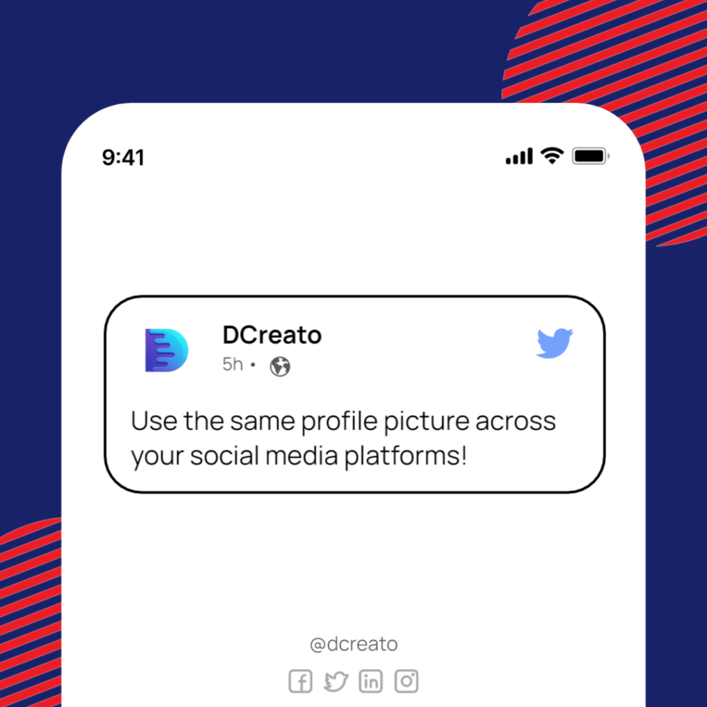
Use the same profile picture across your social media platforms!
It's essential to make sure you have a cohesive brand image on all of your social media sites. People want to feel like they are getting the same experience no matter where they follow you, so try picking one main photo and using it for Facebook, Twitter, and Instagram. You can also use this photo for your profile picture to keep things consistent!
Conclusion
The goal of any brand is to stand out in the crowd and be memorable. There are countless ways that you can do this, but one way is by using color! The trick here is finding colors that go well together without being too overbearing or difficult to read. In general, darker shades are easier on the eyes, while brighter ones are eye-catching.
You may also want to consider shapes like circles, triangles, or diamonds for extra flair and pizzazz when designing your logo, which will help it stand out from the pack by providing something entertaining people can look at. At the same time, they wait on their computer loading time.
Finally, remember to check all spelling and grammar before publishing, so everything looks professional and polished instead of sloppy mistakes with punctuation marks in places where they don't belong.
FAQ's
How many colors should be in a logo?
The more colors in a logo, the more difficult it is to read, so try using different shades of just one color family that are easy on the eyes.
The general rule of thumb is two to three colors maximum for any design. Color schemes are usually determined by brand identity and message, but some designers work better with many! The more colors you use, the less each color can stand out, which reduces the legibility of your design.
As always, logo design is about finding a balance between what you want your customer to see prominently and reproducing quickly while conveying your message.
What shapes can I use for my logo design?
There are several shapes you can use in your logo design, and any shape is fine! For example, some people make circles while others opt for straight lines while shapes like squares, diamonds, and triangles may also appeal to your branding.
I think it's essential to be inventive with the shapes you're using, but it's worth noting that the bigger the shape (especially if you include words), the more legibility will be lost.
What should I do if everyone else has a similar logo?
It doesn't matter whether other companies have logos or colors that seem similar since there are no steadfast rules on what's legal under copyright law. Ultimately, copyright deals with protecting works of art...realistically speaking, there aren't many businesses out there that compare to the Mona Lisa in terms of art, so it's not likely that someone would sue you for having a similar logo.
However, I wouldn't recommend getting too close to any major brand or corporation unless you know what you're doing since they have more resources than most small businesses and could take legal action against your company which is why it is best to seek legal advice you're concerned.
Can I use the same photo for different social media accounts?
It's essential to make sure you have a cohesive brand image on all of your social media sites. People want to feel like they are getting the same experience no matter where they follow you, so try picking one main photo and using it for Facebook, Twitter, and Instagram. You can also use this photo for your profile picture to keep things consistent!
About Author

Hameed Aslam
Hameed Aslam is a website design and development expert, as well as an SEO and content strategist. He is the founder of DCreato and many other online ventures. Hameed's skills with web design, development, SEO, and content marketing have helped him achieve success in online business. He loves to help others learn about these topics so that they can also be successful online.


Latest Comments 0 Responses